top of page

MOONLIT
Branding Projects
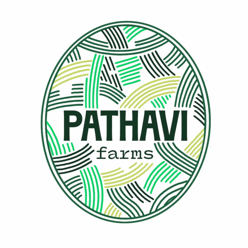
// 01 // PATHAVI FARMS
// LOGO DESIGNS EXPLORED

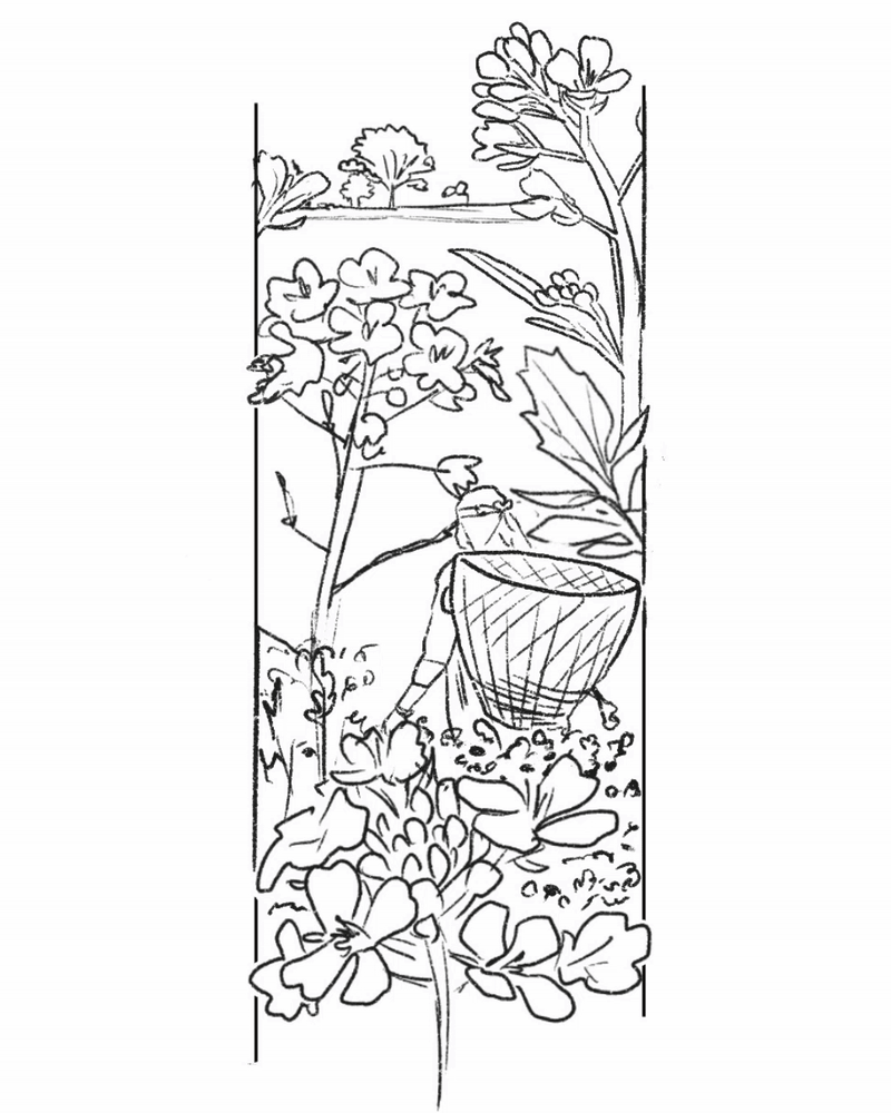
Pathavi Farms is a fresh-from-farm-to-table company that works directly with farmers. The task was to design the logo and 3 product label designs that would feel as authentic as the produce itself.
To mirror their organic ethos, we went for a detailed sketch illustration style, bringing an authentic hand-done quality, almost like a story being drawn in real time. The labels highlight farmers, farm life, tools and moments from the fields, grounding the brand in the honesty of where the produce comes from.
// PRODUCT LABEL DESIGNS


// 02 // ADAMANT
// IDENTITY


"it's a new Indian agency that'll create disruptive work, let's try a few routes to see what works best!"
Vehemently bold with an uncompromising energy. The final logo features 3 contrasting typefaces, a shocking red palette, and a 3D glass finish.
An identity that's true to its name.


// THE BRAND BOOK


1/12
// 03 // TWO BROTHERS ORGANIC FARMS
As part of the pitch, my task was to reimagine the visual expressions for an organic farm brand run by two brothers. Especially the illustration style - currently a flat vector illustration. Inspired by Chobani's filled and vibrant art style, here's what was created for TBOF.
// BANNER CREATIVES
// EMAILER
UPDATING SOON.


bottom of page